Managing your library
The Library is the app’s home base, where you browse everything, switch pets and objects on and off, and manage your own creations. This page is a tour of it.
Getting around
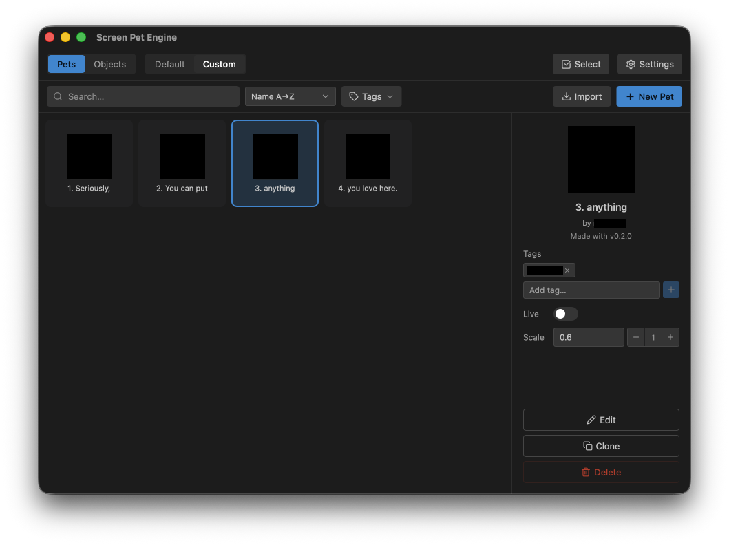
Section titled “Getting around”Along the top you will find two toggles that decide what the grid shows:
- Pets / Objects. Switch between your character pets and your scenery objects. They are managed separately.
- Default / Custom / Collab. Default is the read-only set that ships with the app; Custom is where the pets and objects you create or clone live. Collab holds collaboration items made by guest artists, and only appears once your copy of the app includes some.
Below that is the find bar:
- Search. Type to filter the grid by name (updates as you type).
- Sort. Order by Name A→Z or Name Z→A.
- Tags. Filter by one or more tags. Selecting several narrows results to items that have all of them. Tags are scoped to the current tab.
The Import and New Pet / New Object buttons appear only when you are on the Custom source: you cannot add to or overwrite the items that ship with the app.
Cards and the Live badge
Section titled “Cards and the Live badge”Each item is a card showing its icon and name. A card with a green Live dot is currently running on your desktop. If a card looks dimmed with a warning icon, that item could not be loaded, usually because it was made in a newer version or its files are damaged.
Click any card to select it and open its detail panel on the right.
The detail panel
Section titled “The detail panel”The detail panel is where you act on the selected item:
- Live toggle. Spawn or remove the item on screen (same as described in Running your first pet).
- Scale. Resize the on-screen item, from 0.1× to 20×.
- Layer (while Live). A Back / Front control that sets whether this item sits in front of or behind other live items of the same type (pet over pet, object over object). Pets and objects sit in separate layer bands, so this does not mix the two.
- Reset position (objects, while Live). Snaps an object back on-screen if you have dragged it out of view.
- Tags. Add or edit tags to organize your collection. (Disabled for Default and Collab items, and while the item is open in an editor.)
The panel also has action buttons:
- Edit. Open the item in its editor (behavior graph editor for pets, the Object Editor for objects). Custom items only.
- Clone. Make an editable copy. Available for your own custom items and for the built-in defaults: cloning a default gives you a custom copy to change however you like, and the original stays exactly as it shipped.
- Delete. Remove a custom item for good.
Default items are read-only, so they show no Edit or Delete button, but they can be cloned. Collab items are the guest artists’ work rather than ours to give away, so they cannot be cloned, edited, exported, or deleted: you can place them on screen, resize them, and turn them off, and that is all.
Creating new items
Section titled “Creating new items”- New Pet opens the behavior graph editor on a new pet, starting with a template picker: pick one of four quick-start graphs, or dismiss it for a blank canvas. See Creating pets: an overview.
- New Object asks for a name, then opens the Object Editor. See Objects & props.
A brand-new custom pet cannot go Live until its behavior graph is valid: you will see a hint like “No behavior graph yet. Open the editor, connect Start → an action, then save.” Once you have wired up and saved a working graph, the toggle unlocks.
Sharing pets & objects
Section titled “Sharing pets & objects”Custom pets and objects can be shared as small bundle files.
- Export. Open a custom pet or object in its editor and use its Export
action. You get a bundle file:
.spefor a pet,.speofor an object. Send it to anyone however you like. - Import. On the Custom source, click Import and pick a
.speor.speobundle. The item is added to your library, ready to toggle Live.
Collab items cannot be exported: they belong to the artists who made them. Very large bundles are rejected, so keep sprite sheets to a sensible size.
Turning several on or off at once
Section titled “Turning several on or off at once”Click Select (top of the window) to enter multi-select mode. Tick the cards you want, then use the bulk bar to Turn On, Turn Off, or Delete (custom only) all of them together. Select All / Deselect are there too. Press Esc to leave select mode. Selections do not carry across the Pets/Objects tabs.